Understanding data by touching it
Reading and understanding data is not always a simple task. To make it easier, Samuel Huron is developing tools that allow us to handle data physically. The Télécom Paris researcher in data visualization and representation seeks to make complex information understandable to the general public.
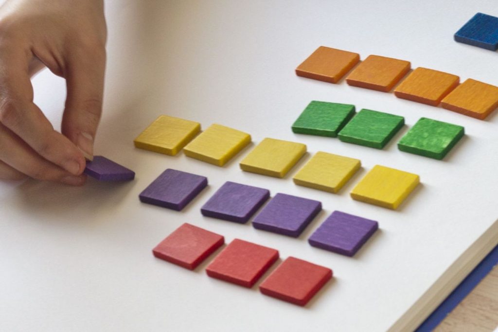
Before numbers were used, merchants used clay tokens to perform mathematical operations. These tokens allowed them to represent numerical data in a graphical, physical way, and handle it easily. This kind of token is still used in schools today to help young children become familiar with complex concepts like addition and cardinality. “This very simple tool can open the door to highly complex representations, such as the production of algorithms,” says Samuel Huron, a researcher at Télécom Paris in the fields of data visualization and interactive design.
His work aims to use this kind of simple representation tool to make data understandable to non-experts. “The best way to visualize data is currently programming, but not all of us are computer engineers,” says Samuel Huron. And while providing the entire population with training in programming may be a commendable idea, it is not very realistic. This means that we must trust experts who, despite their best intentions, may provide a subjective interpretation of their observation data.
In an effort to find an alternative, the researcher has taken up the idea of clay tokens. He organizes workshops for people with little or no familiarity with handling data, and proposes using tokens to represent a data set. For example, to represent their monthly budget. Once they have the tokens in their hands, the participants must invent graphical models to represent this data based on what they want to get out of it. “One of the difficult and fundamental things in graphical data analysis is choosing the useful representation for the task, and therefore targeting the visual variables to understand your batch of data,” explains Samuel Huron. “The goal is to teach the participants the concept of visual mapping.”
Video: how does physical representation of data work:
The visualization is not only intended to represent this data, but to develop the capacity to read and make sense of it. Participants must find a way to structure the data themselves. They are then encouraged to think critically by observing the other productions, in particular to see whether they can be read and understood. “In certain workshops with many different data sets, such as the budget of a student, an employed individual, or a retiree, participants can sometimes identify a similar profile just by looking at the representations of other participants,” adds the researcher.
Citizen empowerment
This transmission method poses real challenges for democracy in our era of digitization of knowledge and the rise of data. To understand the important issues of today and respond to the major challenges we face, we must first understand the data from various fields. Whether related to budgets, percentage of votes, home energy consumption, or the daily number of Covid-19 cases, all of this knowledge and information is provided in the form of data, either raw or processed to some extent. And to avoid dealing with abstract figures and data, it is represented visually. Graphs, curves and other diagrams are provided to illustrate this data. But these visual representations are not always understandable to everyone. “In a democracy, we need to understand this data in order to make informed decisions,” says Samuel Huron.
Citizen empowerment is based on the power to make decisions, taking into account complex issues such as climate change or the national budget breakdown. Likewise, to tackle the coronavirus, an understanding of data is required in order to assess risk and implement health measures of varying strictness. It was this societal issue that pushed Samuel Huron to look for data visualization methods that can be used by everyone, with a view to data democratization. This approach includes open data policies and transparency, of course, as well as useful and user-friendly tools that allow everyone to understand and handle this data.
Thinking about the tools
“A distinctive characteristic of human beings is producing representations to process our information,” says the researcher. “The alphabet is one such example: it’s a graphical encoding to store information that other people can find by reading it.” Humankind has the capacity to analyze images to quickly identify and examine a set of diagrams, without even thinking at times. These cognitive capacities enable operations in visual space that are otherwise very difficult and allow them to be carried out more quickly than with another kind of encoding, such as numbers.
This is why we tend to illustrate data graphically when we need to explain it. But this is time-consuming and graphs must be updated with each new data set. On the virtual side, there is no shortage of software spreadsheet solutions that allow for dynamic, efficient updates. But they have the drawback of limiting creativity. “Software programs like Excel are great, but all of the possible actions are predefined. Expressiveness of thought is limited by the models offered by the tool,” says Samuel Huron.
Far from considering tokens to be the ideal solution, the researcher says that they are above all a tool for teaching and raising awareness. “Tokens are a very simple format that make it possible to get started quickly with data visualization, but they remain quite limited in terms of representation,” he says. He is working with his colleagues to develop more complicated workshops with larger data sets that are more difficult to interpret. In general, these workshops also aim to think about ways to promote the use of data physicalization, with more varied tools and data sets, and therefore more diverse representations. Other studies intend to consider the value of the data rather than that resulting from its handling.
By proposing these data physicalization kits, the researchers can study participants’ thinking. They can therefore better understand how individuals understand, format, handle and interpret data. These observations in turn help the researchers improve their tools and develop new ones that are even more intuitive and user-friendly for different groups of individuals. To go further, the researchers are working on a scientific journal devoted to the topic of data physicalization planned for late 2021. It should assess the state of the art on this topic, and push research in this area even further. Ultimately, this need to understand digital data may give rise to physical tools to help us grasp complex problems – literally.
By Tiphaine Claveau.


Leave a Reply
Want to join the discussion?Feel free to contribute!